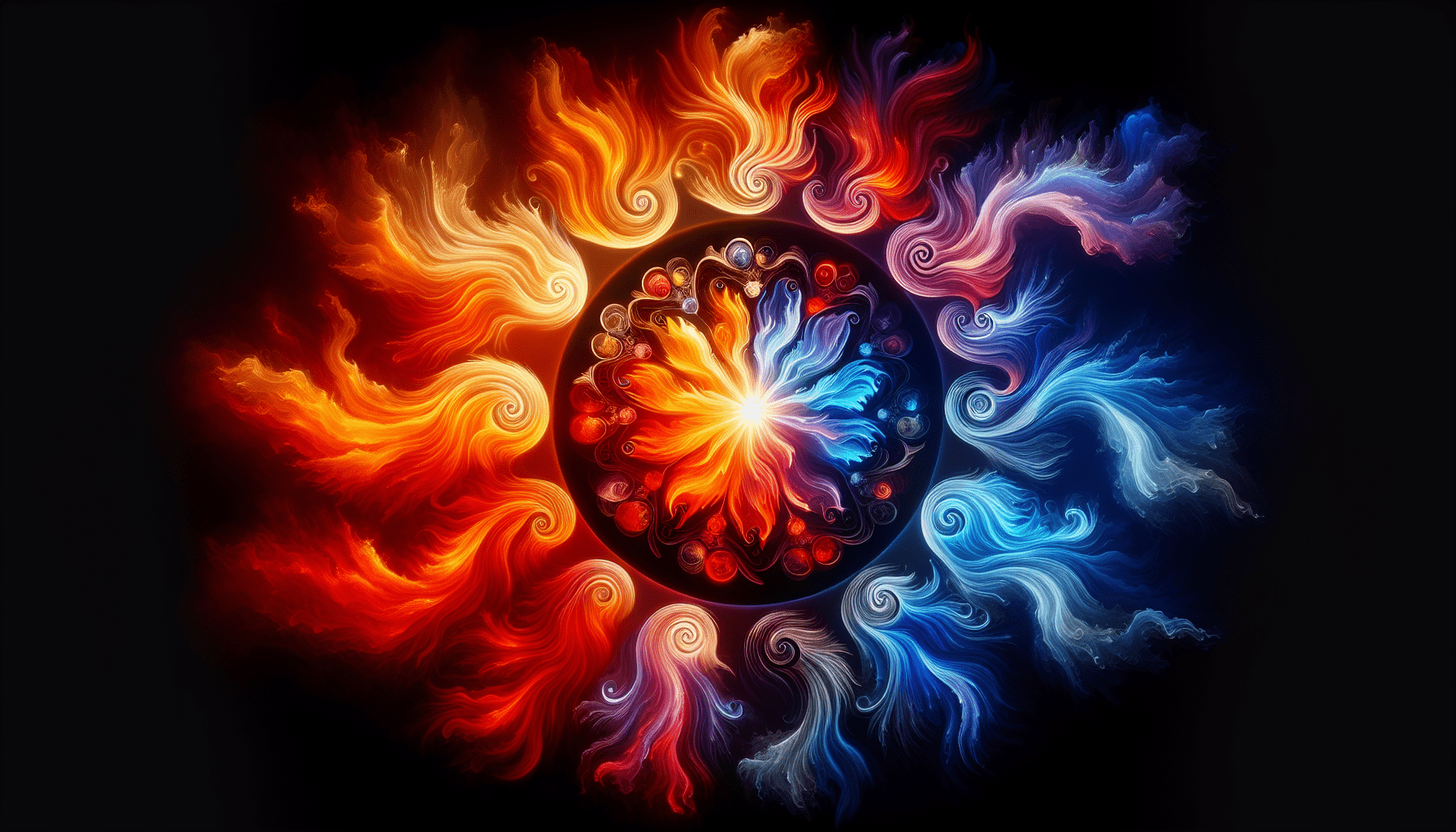
In the captivating world of Illumination Art, colors play a profound role in eliciting emotions and creating a mesmerizing visual experience. Delving into the psychology of colors reveals an intricate connection between color choices and the human psyche. From the soothing blues that evoke tranquility to the vibrant yellows that evoke energy and optimism, each shade holds the power to evoke a specific emotional response. Join us on a captivating journey as we explore the fascinating world of how colors shape our perception and understanding of Illumination Art.

The Meaning and Symbolism of Colors
Colors play a significant role in our lives, affecting our emotions and perceptions in various ways. In illumination art, colors are used to evoke specific feelings and create meaningful experiences. Each color holds its own symbolism and can convey different messages to the viewer. Understanding the meaning behind each color can enhance our appreciation for illumination art and allow us to connect with the artworks on a deeper level.
Red: Passion and Energy
The color red is often associated with passion, energy, and vitality. It has the power to evoke strong emotions and grab attention. In illumination art, red can be used to create a sense of excitement and intensity. It can symbolize love, desire, and power, making it a popular choice for artworks that aim to evoke strong emotional responses. Whether used sparingly or as the dominant color, red has the ability to captivate and energize the viewer.
Orange: Creativity and Enthusiasm
With its warm and vibrant hue, orange is a color that is often associated with creativity and enthusiasm. In illumination art, orange can be used to evoke a sense of excitement and inspiration. It is a color that encourages us to think outside the box and embrace our creativity. Orange can also represent warmth and optimism, making it an ideal choice for artworks that aim to uplift and inspire viewers.
Yellow: Happiness and Optimism
Yellow is often associated with happiness, joy, and positivity. It is a color that can instantly brighten up a space and create a cheerful atmosphere. In illumination art, yellow can be used to evoke feelings of warmth and optimism. It is a color that symbolizes sunshine and can bring a sense of lightness and positivity to artworks. From soft pastel yellows to bold and vibrant tones, the use of yellow in illumination art can create a sense of joy and radiance.
Green: Harmony and Balance
Green is a color that is often associated with nature, harmony, and balance. It is a color that represents growth and renewal. In illumination art, green can be used to create a sense of calmness and tranquility. It can symbolize harmony and balance, making it a popular choice for artworks that aim to create a soothing and peaceful atmosphere. From lush green landscapes to subtle accents of green, the use of this color in illumination art can evoke a connection to nature and a sense of serenity.
Blue: Serenity and Tranquility
Blue is a color that is often associated with serenity, tranquility, and calmness. It is a color that can create a sense of relaxation and peace. In illumination art, blue can be used to evoke a soothing and serene atmosphere. Whether it is a deep navy blue or a soft sky blue, the use of blue hues can transport viewers to a tranquil and serene state of mind. Blue is also often associated with water, representing depth and purity.
Purple: Royalty and Luxury
Purple is a color that is often associated with royalty, luxury, and power. It is a color that conveys a sense of elegance and sophistication. In illumination art, purple can be used to create a regal and luxurious atmosphere. It can evoke feelings of extravagance and opulence, making it a popular choice for artworks that aim to create a sense of grandeur. Whether used as an accent color or as the dominant hue, purple can add a touch of elegance and luxury to illumination art.
Pink: Calmness and Femininity
Pink is a color that is often associated with calmness, femininity, and sweetness. It is a color that can create a soft and gentle atmosphere. In illumination art, pink can be used to evoke feelings of tranquility and serenity. It is often used in artworks that aim to create a sense of intimacy and tenderness. Whether it is a pale blush pink or a vibrant fuchsia, the use of pink hues in illumination art can create a soothing and calming effect.
White: Purity and Innocence
White is a color that is often associated with purity, innocence, and cleanliness. It is a color that can create a sense of simplicity and clarity. In illumination art, white can be used to evoke a feeling of purity and freshness. It can symbolize a new beginning and a clean slate. Whether used as the main color or as a background, white can create a sense of lightness and purity in illumination art.
Black: Sophistication and Mystery
Black is a color that is often associated with sophistication, elegance, and mystery. It is a color that can create a sense of drama and intrigue. In illumination art, black can be used to evoke a feeling of sophistication and depth. It can add a touch of mystery and allure to artworks. Whether used as a dominant color or in combination with other hues, black can create a powerful and captivating effect in illumination art.
The Influence of Colors on Emotions
Colors have a profound impact on our emotions and can elicit different responses depending on their warmth, coolness, or neutrality. Understanding the influence of colors on our emotions can help artists and designers create impactful illumination art that resonates with viewers.
Impact of Warm Colors
Warm colors such as red, orange, and yellow tend to evoke feelings of warmth, energy, and excitement. They can create a sense of passion and intensity. These colors are often associated with positive emotions such as joy, happiness, and enthusiasm. In illumination art, warm colors can be used to create a vibrant and energetic atmosphere, grabbing the viewer’s attention and evoking a sense of excitement.
Effect of Cool Colors
Cool colors such as blue, green, and purple tend to evoke feelings of calmness, serenity, and relaxation. They can create a sense of tranquility and peace. These colors are often associated with soothing emotions such as calmness, serenity, and introspection. In illumination art, cool colors can be used to create a peaceful and serene atmosphere, inviting the viewer to relax and unwind.
The Role of Neutral Colors
Neutral colors such as white, black, and gray tend to evoke feelings of balance, simplicity, and neutrality. They can create a sense of calmness and stability. Neutral colors are often associated with emotions such as clarity, purity, and sophistication. In illumination art, neutral colors can be used to create a clean and minimalist atmosphere, allowing the viewer to focus on the artwork itself without distractions.
Contrasting Colors and Emotional Response
Contrasting colors, such as pairing warm and cool colors or using complementary colors, can create a dynamic and visually striking effect in illumination art. The contrast between colors can evoke a strong emotional response. For example, the combination of red and blue can create a sense of tension and energy, while the combination of yellow and purple can create a sense of harmony and balance. Contrasting colors can be used strategically in illumination art to convey a specific emotional message and create visual interest.
The Role of Colors in Artistic Expression
Colors are an essential tool in artistic expression, allowing artists to evoke specific emotions and create unique visual experiences. In illumination art, color selection plays a crucial role in creating an emotional atmosphere, enhancing visual dynamics and depth, conveying symbolism and meaning, and establishing a focal point.
Creating an Emotional Atmosphere
Colors have the power to evoke strong emotions and can set the tone for a particular artwork. By carefully selecting the right colors, artists can create an emotional atmosphere that resonates with viewers. For example, warm colors such as red and orange can create a vibrant and energetic atmosphere, while cool colors such as blue and green can create a soothing and serene atmosphere.
Enhancing Visual Dynamics and Depth
Colors can greatly enhance the visual dynamics and depth of an artwork. By using a combination of contrasting colors, artists can create a sense of depth and dimension. For example, the use of warm colors in the foreground and cool colors in the background can create a visually striking effect. Colors can also be used to create illusions of space and movement, adding an extra layer of visual interest to illumination art.
Conveying Symbolism and Meaning
Colors have a rich history of symbolism and can convey meaning beyond their visual appearance. Artists can use colors to convey specific messages or symbolize abstract concepts. For example, the use of red in an artwork can symbolize passion and love, while the use of white can symbolize purity and innocence. By choosing colors strategically, artists can create artworks that are rich in symbolism and meaning.
Establishing a Focal Point
Colors can be used to establish a focal point in illumination art, directing the viewer’s attention to a specific area or element within the artwork. By using a bold and vibrant color against a more subdued background, artists can create a focal point that immediately grabs the viewer’s attention. This technique can be particularly effective in creating a sense of balance and harmony within an artwork.
Color Selection in Illumination Art
Color selection in illumination art involves careful consideration of the artwork’s purpose, emphasizing harmonious color schemes, exploring contrasting combinations, utilizing complementary colors, and harnessing the psychological power of monochromatic color.
Considering the Purpose of the Artwork
When selecting colors for illumination art, it is important to consider the artwork’s purpose and the desired emotional response from viewers. For example, if the artwork aims to create a soothing and relaxing atmosphere, cool colors such as blue and green can be chosen. On the other hand, if the artwork aims to evoke excitement and energy, warm colors such as red and orange can be selected. Understanding the intent of the artwork allows artists to choose colors that are aligned with the desired emotional impact.
Emphasizing Harmonious Color Schemes
A harmonious color scheme involves colors that are adjacent to each other on the color wheel, creating a visually pleasing and balanced effect. By using harmonious color schemes, artists can create a sense of unity and coherence within an artwork. For example, using various shades of blue and green in an illumination art piece can create a harmonious and tranquil atmosphere. Harmonious color schemes can be particularly effective in creating a sense of balance and harmony between different elements within an artwork.
Exploring Contrasting Combinations
Contrasting color combinations involve colors that are opposite each other on the color wheel, creating a visually striking and impactful effect. By using contrasting color combinations, artists can create a sense of tension and energy within an artwork. For example, pairing warm colors such as red and orange with cool colors such as blue and green can create a dynamic and visually intriguing effect. Contrasting color combinations can be used strategically to create visual interest and evoke specific emotional responses from viewers.
The Use of Complementary Colors
Complementary colors are pairs of colors that are opposite each other on the color wheel, creating a high-contrast effect. By using complementary colors in illumination art, artists can create a sense of vibrancy and visual tension. For example, the combination of blue and orange, or purple and yellow, can create a visually striking and harmonious effect. Complementary colors can be used to create a focal point or highlight specific elements within an artwork.
The Psychological Power of Monochromatic Color
Using a monochromatic color scheme involves using variations of a single color, creating a visually cohesive and harmonious effect. By using monochromatic color schemes, artists can create a sense of sophistication and depth. For example, using different shades of blue in an artwork can create a calming and serene atmosphere. Monochromatic color schemes can be particularly effective in creating a sense of unity and focus within an artwork.

Color Choice and Cultural Influences
Colors have different cultural associations and symbolisms, and their meanings may vary across different cultures. When creating illumination art, it is important to consider the cultural influences and associations of colors to ensure that the artwork communicates its intended message effectively in a global context.
Color Symbolism in Different Cultures
Colors hold different meanings and symbolisms in various cultures around the world. For example, while white is associated with purity and innocence in Western cultures, it is often associated with mourning and funerals in some Eastern cultures. Similarly, red can symbolize good luck and prosperity in some Asian cultures, while in Western cultures, it is often associated with passion and intensity. Understanding color symbolism in different cultures is essential in creating illumination art that resonates with a global audience.
Cultural Associations with Specific Colors
Specific colors can have strong cultural associations and connotations. For example, in Western cultures, blue is often associated with trust, loyalty, and peace, while in some African cultures, it is associated with spirituality and protection. Similarly, in Western cultures, yellow is often associated with happiness and optimism, while in some Latin American cultures, it is associated with mourning and death. Being aware of the cultural associations of specific colors helps artists create culturally sensitive illumination art.
Interpreting Color Meanings in a Global Context
Color meanings can vary widely across different cultures, and it is important to interpret color symbolism in a global context. Artists and designers must consider how colors are perceived and understood by different audiences to ensure that their artworks effectively communicate their intended message. This involves conducting research and gaining a deeper understanding of the cultural influences on color symbolism.
The Psychology of Light and Color Perception
The interplay between light and colors greatly influences our perception and emotional response to artworks. Understanding the psychology of light and color perception is essential in creating impactful illumination art that engages and resonates with viewers.
The Impact of Light Intensity
The intensity of light can greatly influence our perception of colors. Bright and intense light can make colors appear more vibrant and saturated, evoking a sense of energy and excitement. On the other hand, dim or soft light can make colors appear more muted and subdued, creating a sense of calmness and relaxation. By carefully considering the intensity of light, artists can create the desired emotional atmosphere in their illumination art.
Color Perception and Psychological Factors
Our perception of colors is influenced by various psychological factors, such as our past experiences, cultural backgrounds, and personal preferences. Colors can evoke different emotions and associations based on individual experiences. For example, a color that is associated with positive memories for one person may evoke negative emotions for another. Understanding the psychological factors that influence color perception allows artists to create illumination art that resonates with viewers on a personal level.
The Influence of Surrounding Colors
The surrounding colors in an artwork can greatly influence our perception and emotional response to individual colors. Colors can look different depending on the colors that surround them. For example, a color may appear brighter and more vibrant when placed against a contrasting background, while it may appear more subdued when placed against a similar color. By considering the influence of surrounding colors, artists can create visual effects and illusions in their illumination art.
Color Psychology in Interior Illumination
Color selection in interior illumination plays a crucial role in creating ambiance, setting the mood, and influencing the overall experience of a space. Understanding color psychology in interior illumination allows designers to create spaces that evoke specific emotions and enhance the well-being of occupants.
Creating Ambiance and Mood
Color selection in interior illumination greatly contributes to the overall ambiance and mood of a space. Warm colors such as red and orange can create a lively and energetic atmosphere, while cool colors such as blue and green can create a calm and soothing environment. By strategically choosing the right colors, designers can create spaces that evoke specific emotions and enhance the desired mood.
Color Choice for Specific Spaces
Different spaces have different functions and purposes, and color choice should align with these specific functions. For example, in a bedroom, soft and calming colors such as pastel blues or greens can create a relaxing and peaceful atmosphere conducive to sleep. In a dining area, warm and vibrant colors such as reds or oranges can create an inviting and stimulating environment. By considering the specific functions of spaces, designers can select colors that enhance the intended purpose of the space.
The Psychological Effects of Color Temperature
Color temperature, measured in Kelvin (K), refers to the warmth or coolness of light. Warm color temperatures (around 2700-3000K) are often associated with coziness and relaxation, while cool color temperatures (around 5000-6500K) are associated with alertness and focus. By choosing the right color temperature for interior illumination, designers can create spaces that enhance productivity, well-being, and overall comfort.
The Power of Color in Advertising and Marketing
Colors play a crucial role in advertising and marketing, as they can influence consumer perceptions, evoke emotions, and enhance brand recognition. Understanding color psychology in advertising and marketing allows brands to create impactful campaigns that effectively convey their message and attract their target audience.
Color Psychology in Advertising
Color psychology in advertising refers to the use of colors to evoke specific emotions and influence consumer behavior. Different colors can elicit different emotional responses from consumers, and advertisers strategically choose colors that align with their brand identity and intended message. For example, red can create a sense of urgency and excitement, making it a popular choice for sales and promotions. By understanding the psychological impact of colors, advertisers can create effective campaigns that resonate with their target audience.
Colors and Branding Strategies
Colors play a crucial role in brand recognition and differentiation. Different colors can evoke different associations and connotations, and brands use colors strategically to convey their core values and personality. For example, blue is often associated with trustworthiness and reliability, making it a popular choice for technology and financial brands. By selecting the right colors for their branding, companies can establish a strong visual identity and create a lasting impression on consumers.
Utilizing Color to Evoke Desired Emotions
Colors can be used strategically in marketing to evoke specific emotions and influence consumer behavior. By understanding the emotional impact of different colors, marketers can create campaigns that resonate with their target audience and elicit the desired responses. For example, using warm colors such as red or orange can create a sense of excitement and urgency, encouraging consumers to take immediate action. Using cool colors such as blue or green can create a sense of calmness and trust, appealing to consumers who value reliability and stability.
Using Colors to Induce Relaxation and Healing
Colors have the power to influence our well-being and can be used to induce relaxation and promote healing in various environments. Color therapy, also known as chromotherapy, explores the therapeutic effects of different colors on our physical and emotional well-being.
Color Therapy and its Effects
Color therapy is a holistic practice that uses different colors to balance and harmonize our energy centers, also known as chakras. Each color corresponds to a specific chakra and is believed to have unique healing properties. For example, blue is associated with the throat chakra and is believed to promote communication and self-expression, while green is associated with the heart chakra and is believed to enhance emotional well-being and balance. By incorporating color therapy principles into illumination art, designers can create healing environments that promote relaxation and overall well-being.
Color Selection for Healing Environments
When selecting colors for healing environments, it is essential to consider the specific needs and intentions of the space. Soft and calming colors such as blues and greens are often used to create relaxation and promote healing in healthcare facilities. Warm and inviting colors such as oranges and yellows can be used to create a sense of comfort and positivity. By choosing the right colors, designers can create healing environments that enhance the well-being of patients and occupants.
The Positive Impact of Nature-inspired Colors
Nature-inspired colors, such as earth tones and shades of green and blue, have a positive impact on our well-being. These colors are often associated with nature and the outdoors and can create a sense of calmness and harmony within an environment. By incorporating nature-inspired colors into illumination art, designers can create spaces that feel connected to nature and promote relaxation and overall well-being.
The Future of Illumination Art and Color Psychology
As our understanding of color psychology and its influence on our emotions and well-being continues to evolve, the future of illumination art holds exciting possibilities. From innovative use of colors in artistic projects to scientific advancements in understanding color perception, the future of illumination art offers a wide range of opportunities for exploration and experimentation.
Innovative Use of Colors in Artistic Projects
Artists and designers are constantly pushing boundaries and exploring new ways to use colors in their artistic projects. From interactive installations that change colors based on viewers’ emotions to immersive experiences that combine light and color in unique ways, the future of illumination art holds endless possibilities for innovative and exciting projects. The use of cutting-edge technologies, such as LED lighting and programmable control systems, opens up new avenues for artists to create dynamic and immersive color experiences.
Scientific Advancements in Understanding Color Perception
Advancements in scientific research and technology have allowed us to gain a deeper understanding of how colors are perceived and processed by the human brain. As our knowledge of color perception continues to expand, artists and designers can leverage this information to create more impactful illumination art. By combining artistic intuition with scientific insights, artists can create artworks that engage and resonate with viewers on a profound level.
Exploring New Dimensions of Color Influence
The future of illumination art holds the potential to explore new dimensions of color influence, such as the use of bioluminescent materials or the integration of color-changing elements in architectural structures. These advancements in technology and material science provide artists and designers with exciting opportunities to create artworks that go beyond traditional limitations. By harnessing the power of colors in innovative and unexpected ways, the future of illumination art promises to be a vibrant and transformative experience.
In conclusion, colors play a vital role in illumination art, influencing our emotions, perceptions, and overall experience of artworks. By understanding the meaning and symbolism of colors, the influence of colors on emotions, the role of colors in artistic expression, color selection in illumination art, and the psychology of light and color perception, artists and designers can create impactful illumination art that resonates with viewers. Whether creating healing environments, delivering branding messages, or evoking specific emotions, colors have the power to transform and engage our senses. As we look towards the future, the possibilities for innovation and exploration in illumination art are endless, offering exciting opportunities to create truly immersive and transformative color experiences.
Leave a Reply